Your marketing message is communicated by more than the words you choose.
Art and copy come together to form your creative message (with strategy at its core, of course) along with a host of other features that work like a symphony to make your brand sing in tune. When creating a unified marketing message, even the smallest of choices can have a big impact.
Font choice is a design feature that is often overlooked. The choice of font, however says as much as the words it conveys. If you have a brand guideline, odds are that you already know your brand fonts. If you have not yet chosen a brand font, there are a few things you will want to consider first.
Serif Versus Sans-Serif
Ever read a book with a sans-serif font? Likely, no. Serif fonts are easier to read on paper due to the serifs (lines) on each letter. Serifs help the reader connect letters while reading, making the content more legible. Serifs originated in the Latin alphabet with words carved into stone in Roman antiquity. The history of serif brings an inescapable association between serif fonts and their ancestral roots, making them befit sophisticated, academic and thought-provoking communications. If you’re a brand like the New York Times, serif is the obvious choice.
The uprising of screens and technology has brought a boom in the popularity of sans-serif fonts. Sans-serif displays better on digital, whereas serif with their thick and thin lines may not display properly with certain screen resolutions. Sans-serif fonts communicate a more contemporary feel. They add friendliness and less pretension to the message than a serif font. Sans-serif fonts are used by nearly all technology companies for these reasons. Think about a brand like Apple and imagine them using a serif font. They’d be sending a completely different brand message.
How Fonts Make People Feel
Fonts express emotions and as a result, set the emotional tone of the words. Whether it’s assertive, playful, serious, or informative, your font choices express the emotion you want to convey to your reader.
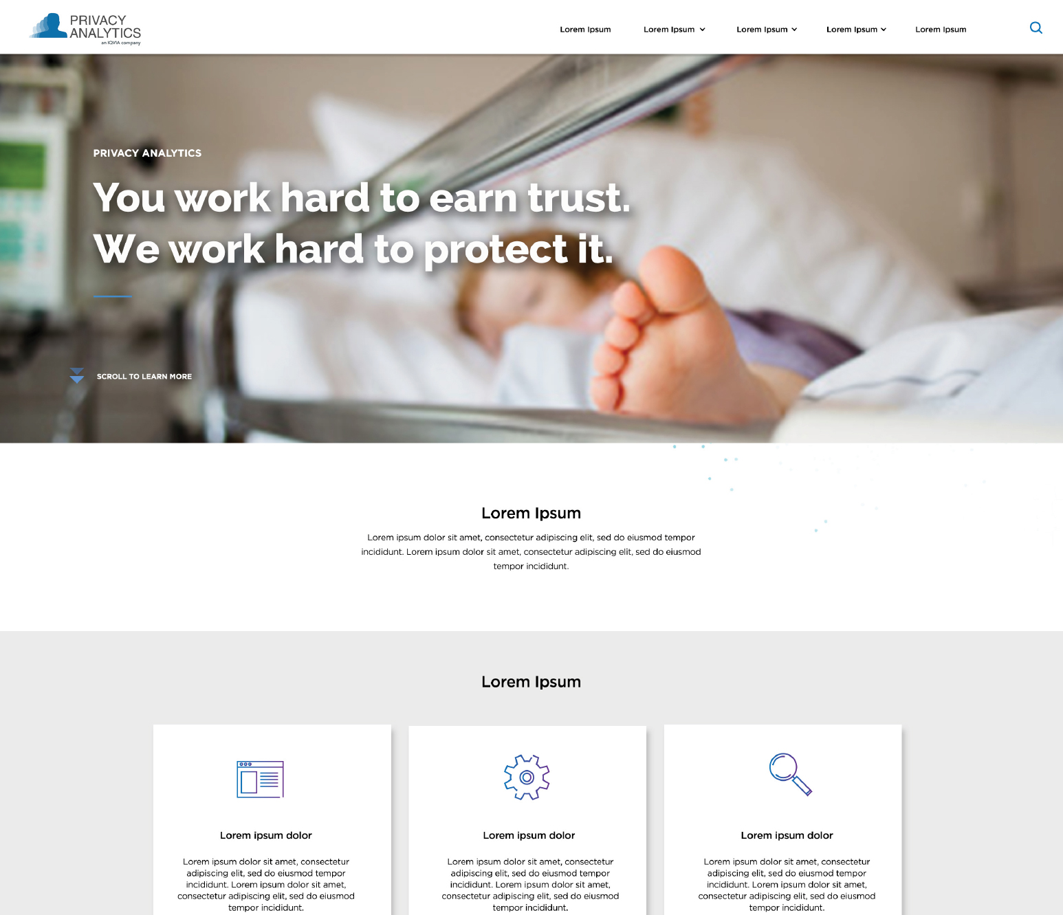
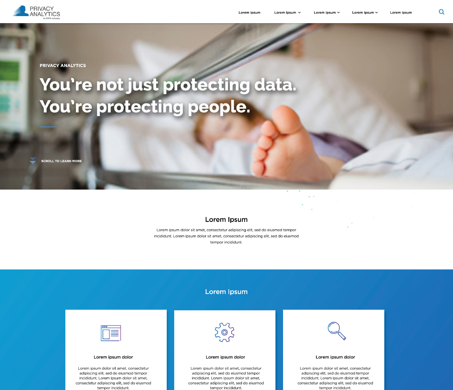
A crucial part of this process is analyzing and understanding context. A design piece for a healthcare client would benefit from a clean and trustworthy font. Posters for a music festival might consider using illustrative and bold fonts. Characteristics to consider when analyzing context includes the message itself, the colour palate, the size of the piece, the delivery method and the industry that the client is in.
The time designers take to find the right font ensures that the content on your website, ads, videos engages your consumer with maximum power.


RECENT POSTS
Universal Adjustable Neck Mount. Wow, that’s a mouthful.
KOOZBALL
COVID VS Creativity