Academic
Sectors / Academic
How do the 1.7 million students who go to university each fall decide which one to go to?
When it comes to student attraction, it takes more than a snappy tagline to stand apart from competing university and college brands.
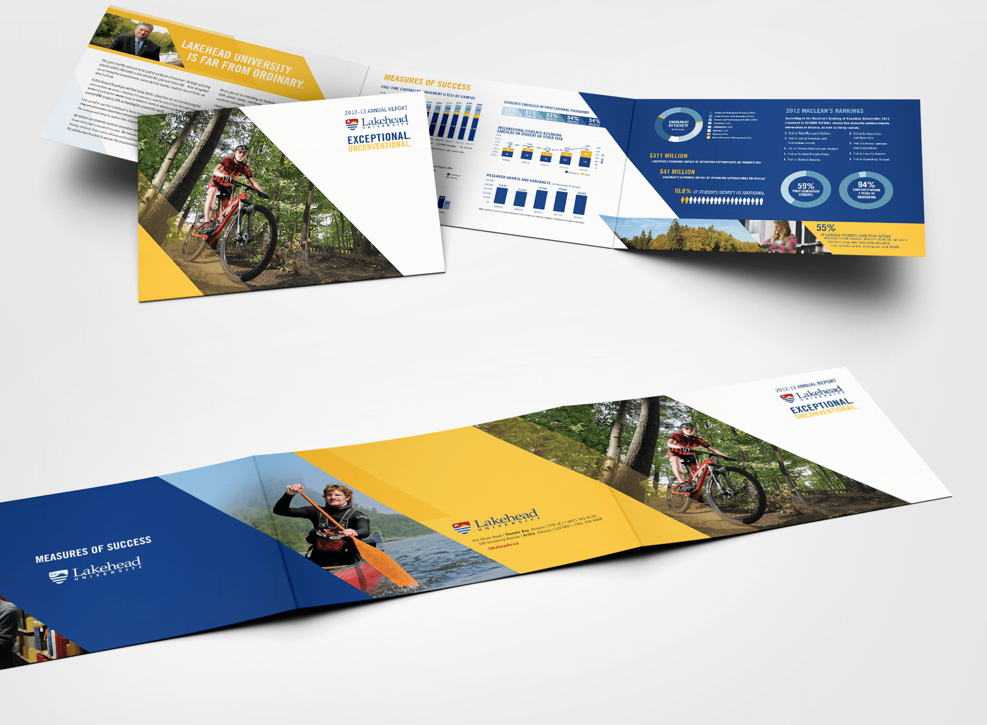
A revised brand strategy and brand experience speaks with greater relevance to Lakehead students over a diverse set of touchpoints.
Fifty’s research revealed that some Ontario students prefer a less conventional university experience.
Insights from high school and first year students guided the development of a new brand platform and visual identity for Lakehead University.


The evolved Lakehead University logo is a reflection of all Lakehead audiences’ perspectives.
The evolved logo reflects student research findings including the use of a symbol of knowledge; a book, and a symbol of the natural landscape on which the Lakehead campuses are located.

The tagline communicated the values that matter most to Lakehead students
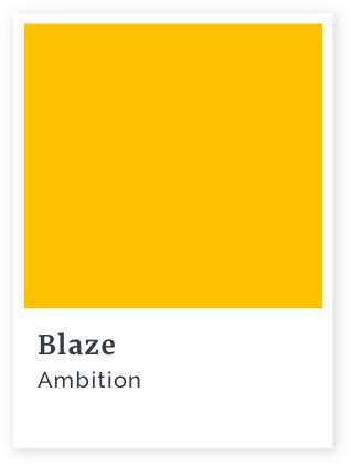
Naming the Lakehead brand colours is just one way the new brand deepened Lakehead’s commitment to expressing it consistently.
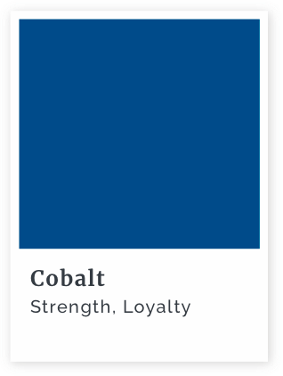
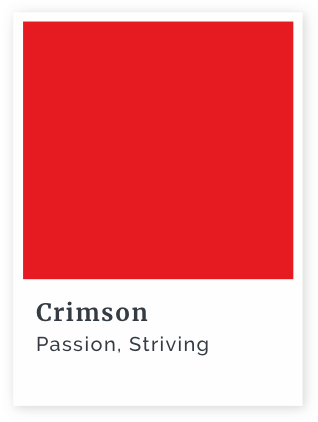
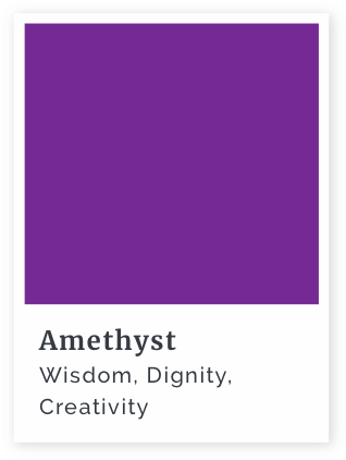


This scale indicates the relative weight, importance and frequency of use that should be placed on the brand colours.


Partner Team:
Fifty and
Brand Clarity
A consistent experience-everywhere audiences interacted with the Lakehead brand.
15 years ago, the average consumer typically used two touchpoints when buying an item and only 7% regularly used more than four. Today consumers use an average of almost six touchpoints, with 50% regularly using more than four.

Research
Audience Research
Brand Strategy
Brand Experience
Logo Design
Tagline Development
Varsity Logos
Way Finding
Clothing
Web
Community Report
Alumni Report
Brand Guidelines
Video Production
Storyboard
Script-writing
Art Direction
Post Production
Recruitment Campaign
and Materials
Booth
Give-aways
Transit
Web
Video
Digital
Google Ads
Do you know what makes your academic brand relevant to your audiences? Do your audiences?
